This page lists small compact fonts that make use of screen real estate the most efficient way.
Making use of more screen real estate doesn't mean you will be more productive. Don't squint. If you try these fonts and you lean forward or squint to read them, then bump the size up. You can still use these fonts 2 sizes bigger or 5 sizes bigger than the smallest size they work at.. and they will save more screen real estate than a courier or courier new of the equivalent size.
All tests were done using Delphi/FP-IDE/Lazarus and other editors. Courier New uses too much space between lines. The most compact font so far that looks great while packing as many lines on the screen as possible, seems to be ProggyOptiS.
Download the compact fonts for Windows
I only tested the fonts on Windows.. I've been meaning to check the fonts on BSD and Linux.
All fonts below were taken on a 17" LCD at 1280x1024 resolution.
Each font displayed below was chosen at the lowest possible size where I could still easily read it.
Click on the image to see a blown up view of the font.
I could go one size smaller than shown below with the OptiS and Tiny, but then the letter 'f' in the word 'interface' became distorted. So that doesn't count.
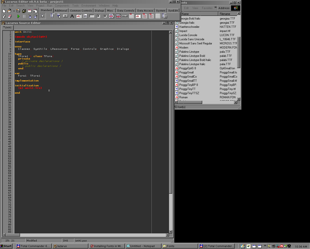
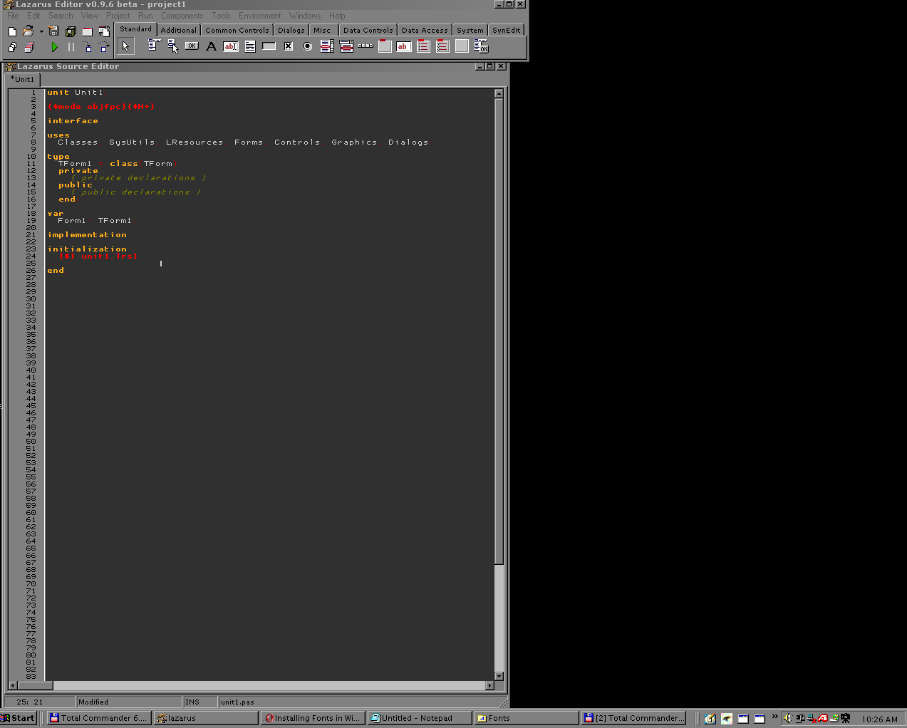
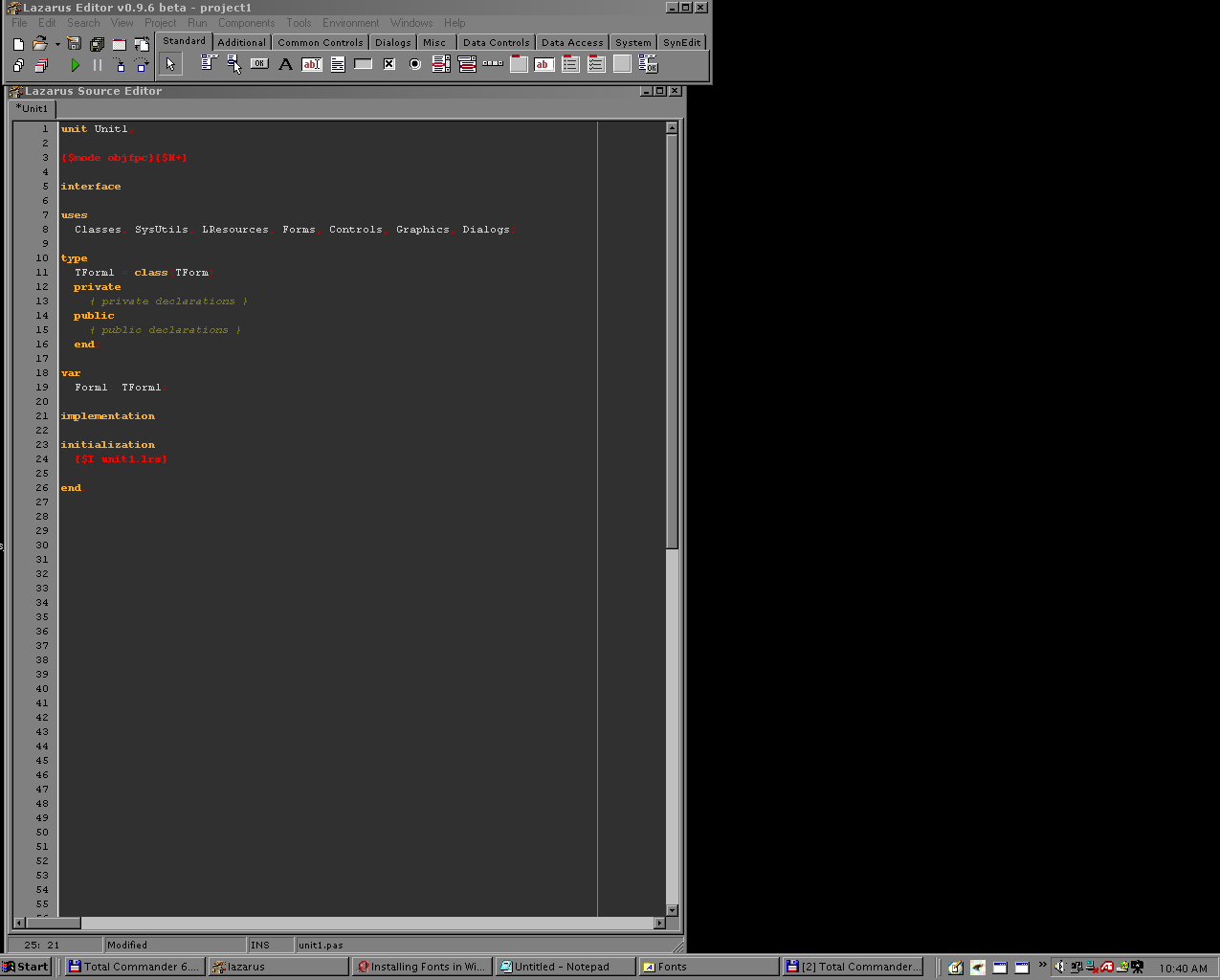
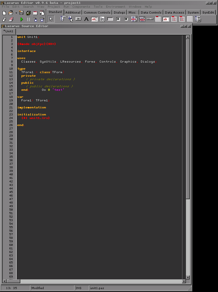
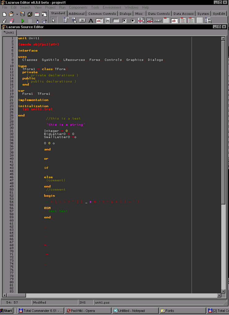
Below screenshots are a comparision between some fonts. Take note of the amount of lines each editor shows in the screenshots. Use your web browser magnifying glass if the pictures do not zoom in automatically for you after clicking.
ProggyOptiS font:

About 83 lines.
ProggyTinyTT font:

About 83 lines.
Courier new font:

Courier above only allows about 55 lines!
Sheldon Narrow Font:
You can only squeeze 69 lines versus 83 or so with the others.

Also, Terminal Font did squeeze in many more lines, but I didn't do any testing on it here. Because the BOLD doesn't work on the small sized Terminal setting.
Tip: To get small fonts that are still readable, it helps if you take off Itallics for comments, and just rely on the syntax highlighting color for them. Itallic text just can't squeeze as much out of the screen, since it more easily becomes distorted.
ProggyOptiS with no itallic fonts:
just relying on yellow/brown

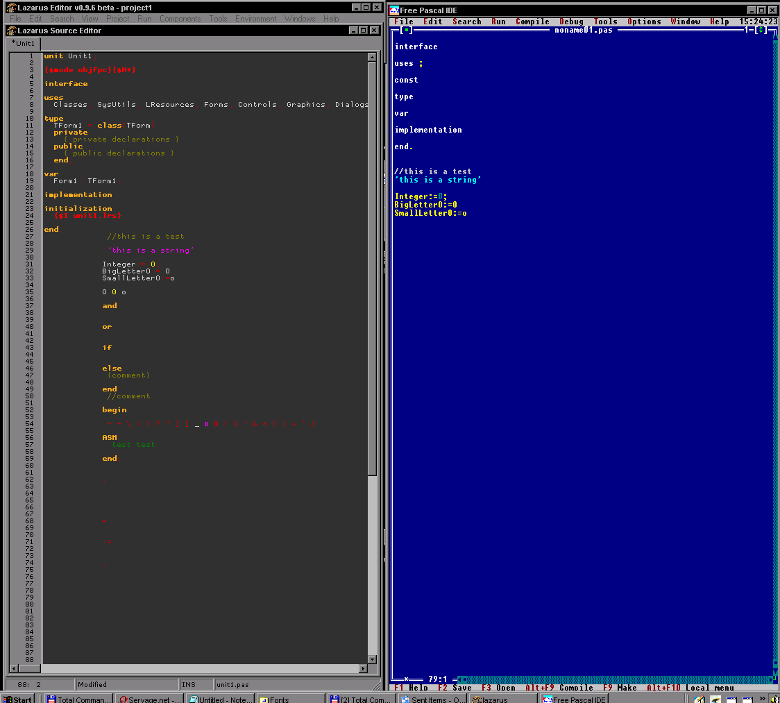
Amount of lines you can squeeze in FP-IDE versus Lazarus:

Keywords: Smallest possible font, programming fonts, programmer fonts, tiny programming fonts, miniature fonts, fixed fonts, micro fonts, mini fonts.
See also: Multiple Monitors, black backgrounds
|
