Black backgrounds are easier on your eyes.

People have been fooled into the "black on white"
syndrome. Yes, this maybe true with paper, that black
on white is easier to read. But on a computer screen,
the story is much different.


I find websites that have darker backgrounds easier
to read. I always set up my text editors and code
editors to have dark backgrounds. Not a pitch black
background if the settings permit it - a shade or so
lighter than pitch black.

Syntax highlighting also jumps out and cheers up the code
with a black background.

Since white is the brightest color of the spectrum, it

 -strains your eyes when seen on a monitor
  (paper is different, since it's not lit up)

 -disturbs other colorful text. Since white is bright,
  syntax highlighting will be harder to configure and
  it will appear more blurry since the white washes
  the colors out with it's super bright powers.

 -Borland and other large corporations like microsoft
  have it backwards. They are wrong. What'd you expect
  to see, the microsoft or borland website with a black
  background? They are followers, not leaders.

 -Black on White tachometers suck. I think of my syntax
  highlighting as my tach at night time.

 -Black saves energy. Especially on a laptop when
  you are running on battery.
Example setup for editing code:
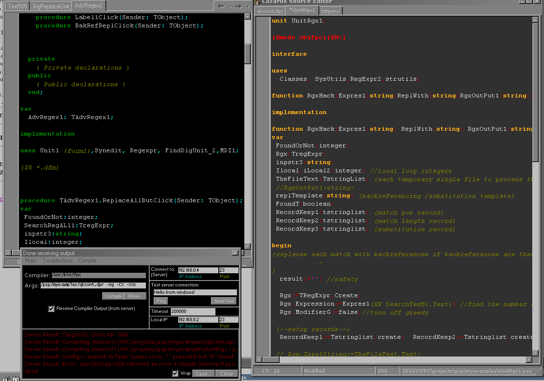
As you can see in the above, on the left, a pitch black background is not as nice. That's okay, choose a slightly lighter black color like on the right (if the editor permits it).
See also: http://www.pessimistic.com/name/black.html
|